Showing posts with label OUGD303DC. Show all posts

Context book printed and bind

I'm really pleased with how the book printed out, as I chose to print onto off white sugar paper so was a little aprehensive about how the colours would turn out. However, the images were really crisp and bright and to continue the hand printed and crafted feel I decided to bind it myself and chose to do a blanket stitch to hold the individual spreads together and a simple crossover stitch to attach the cover and finish it all off.


Here is how the content looked with a blanket stitch before the cover was added:

Context book

Open publication - Free publishing - More book


Here are the spreads printed and ready for binding:

My context book layouts

The idea behind the layout was to keep it simple and where possible create full image spreads to let the research and design speak for itself. Here are a few examples of spreads taken from the 'Top ten handcrafted type' chapter which show just that. This chapter I kept a running theme with the layout as it is a showcase of designer's work grouped together, so it is a good example of the typical style the book is taking.

Another layout

This square format and low set imagery on the spreads is an idea I want to use for a section of my context book, perhaps the 'Top 10 hand crafted typographers' section to keep a running theme throughout the chapter.

Layout ideas

As shown by these practice layouts below, I want the images found and gathered to dominate the spread, so I have explored ways that this could work and where the text could sit around the images. Obviously it depends on the scale of the images found as to where they fit best on the page, but I want to have various layouts that all fit to the same grid, but mix the spreads up a bit to allow the reader to keep interest.


Pulished book layouts

Printed formats give so much scope for variations of layouts, but I want to produce a square format book and here are some double page examples of the look I am going for, taken from New Ornamental Type - a book used for context research on my chosen topic of hand drawn lettering:


Vicki Gausden

'I'm a Freelance Illustrator & Hand Lettering Artist based in Edinburgh, UK. I produce bold, quirky and humorous images that are perfect for print and the web. I like to write and illustrate children's books and I have a passion for cupcakes, pretty patterns and handmade objects. My previous clients include Random House, BEAM Education and the National Trust. ' Taken from her website; www.vickigausden.co.uk

Rachael Taylor designs

Rachael is mainly an illustrator and specialises in surface pattern designs, but I came across her site and really liked the hand drawn type work she has done. She developed an early style in her work which was relevant to many different contexts and many different companies wanted her designs. Clientel examples include: Paperchase, Graham & Brown, WH Smith, Target, UK Greetings, American Greetings, Tigerprint (for Marks & Spencer UK) Hanes Paper, Verbaudet, Redwood and many more. Even her website design took on her style of work:

Card designs for Tigerprint below:


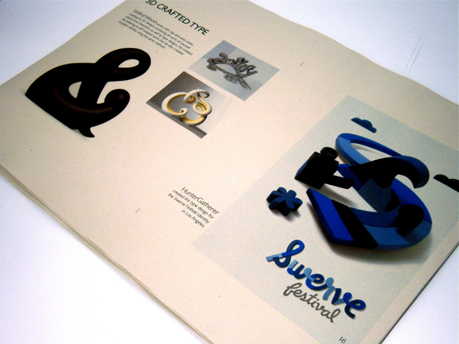
The 3D type book

I'm exploring 3D handcrafted type as one of my chapters and this book has been a brilliant source of information. I want to display work by designers that I have picked out of here in more detail but here are some spread layouts from it for now:


Bibliography

A lot of my context research into handmade, craft, environmental, 2D and 3D type has all come from these books.

I will scan in shots of the pages to show the content in more detail, but for now this is where I have been getting a lot of my research from:

  • Ornamental Type by Steven Heller & Gail Anderson
  • 1000 Type Treatments by Wilson Harvey/Loewy
  • PDW, A Real-World Design Guide by Timothy Samara
  • Handwritten by Steven Heller & Mirko Ilic
  • The Annual of the Type Directors Club
  • The 3D Type book by FL@33
  • Typosphere by Pilar Cano & Marta Serrats

Interview with Jessica Hische

Unfortunately Jessica Hische didn't respond in time to my email but I found an interview of her on methodandcraft.com that is a really interesting read:

'Tell us about your background. How did you get started and when did you begin specializing in lettering?

The wayback-background begins with two very understanding and supportive non-artsy parents that stocked our house full of every pencil, marker, and paint set imaginable. I grew up knowing I wanted to do something art related for a living but had no idea what graphic design was until my Sophomore year of college. I took an intro course and was hooked. Design was satisfying in a completely different way than fine art—everything was like a puzzle you had to solve and it wasn’t (for the most part) self-expressionistic. As a nineteen-year-old from Nowheresville, Pennsylvania who lived a relatively charmed existence, I didn’t feel like I really had much to “express” yet. Being able to think and execute artwork on the behalf of others—to address their needs rather than my own—was a giant “Eureka!” moment.

I couldn’t get enough of my design courses. I was the kid in class everyone hated because they did five times the work they were assigned. It took until almost the end of my senior year for my classmates to realize that I was working hard because I loved it, not because I was trying to one-up them. I procrastinated from every other class to work on design projects. I was insatiable.

I started lettering for the same reason a lot of people do—I was broke and couldn’t afford good typefaces. I was (and remain) a perfectionist. I would find typefaces that were “close but not perfect” and then end up scrapping them all together to make something new. I noticed quickly that incorporating lettering into my projects elevated them above my classmates’—everything was cohesive and considered. At this point, I didn’t realize that it would become my specialty—that it was something you COULD specialize in—but I knew I loved it.

Louise Fili offered me a job soon after I graduated and while working for her I really honed my lettering skills. I was doing a ton of freelance illustration at night and tried to incorporate lettering whenever possible in small ways. Clients started to notice my lettering and were requesting it specifically when hiring me for illustration work. My portfolio quickly transitioned from “illustration” to “illustrative lettering” and continues to evolve with the more lettering work I get.

You mention how cohesive your work becomes since you’re incorporating your own lettering into your projects. To create that harmony, do you typically start with the lettering portion of a project or does the design dictate the form and structure?

I think it’s important to consider lettering and typography early in a project, but not necessarily make ALL of your decisions about it as the first step (meaning don’t solidly declare you MUST use a certain typeface before you’ve addressed the rest of the design). I work very additively in almost everything I do, making general decisions and then shaping and whittling away until the design feels “right”. When I approach a new project, I first think about the general feeling that I want the piece to have—where it should fall on the “vintage” to “modern” scale; the masculine to feminine scale; the minimalist to highly ornate scale. Thinking about a project as being “a moderately vintage, feminine but not overly ornate” is a much less intimidating starting point, and having a general mood goal helps put clients at ease. It’s my tendency to jump to the lettering and type next, but it really varies project to project'

The full interview can be found here

Melinda Beck

'Melinda Beck is an illustrator, animator and graphic designer based in Brooklyn, New York. She received a BFA in Graphic Design from the Rhode Island School of Design in 1989. Her clients include Chronicle Books, GQ, Nickelodeon, Martha Stewart Living, MTV, Nike, Neiman Marcus, The New York Times, Target, and Time Magazine. She has received two Emmy nominations as well as awards from and publication in annuals including American Illustration, The Art Directors Club, Society of Publication Designers, Communication Arts, Print Magazine, The Society of Illustrators, The Broadcast Design Awards and The AIGA. In addition her work has been exhibited in various shows including a new acquisitions show at the Library of Congress.'

melindabeck.com

Giuseppe Salerno

Arcano Arcano is an impres­sive series of let­ter­forms designed by Giuseppe Salerno. Each let­ter­form was hand-drawn in Chinese ink on Japanese cal­lig­ra­phy paper, incor­po­rat­ing nat­ural forms as well as gems, sym­bols and flour­ishes.