One of the main aims in my original Statement of Intent was to drive my work towards a focused portfolio so that it matches my position statement: 'typography and layout for small scale publications and design for print with a focus on hand drawn type and photography.' I feel that the briefs I have chosen to produce work for have allowed me to do this and that by summing up my identity with a hand drawn logo ties it all together and the statement is reflected in what I have to show.
Another main goal was to improve on a lot of things that I picked up on towards the end of the last module, such as better time management and just going with a concept I like straight away instead of spending too much time thinking about it and writing down ideas. I think I improved on aspects of this, but I definitely feel that I haven't produced all four minimum briefs to being substantial briefs of the same standard. A major downfall in my final major project was becoming too interested in the two longer briefs that were supposed to be ongoing and running alongside the other shorter briefs. I really enjoyed the hand crafting that went into the Seasonal Range gift wrap brief and the experimentation of type with the Be-Ro Recipe Book and even though I am really happy with how these two briefs turned out, I really wish I had put as much effort into the other two briefs. I changed my concept and subject of the Rogerthorpe Manor brief and this led to me not having much time to play with multiple concepts resulting in me choosing to go with an idea that I do like, but feel could have been played around with and tested out further. The idea of exploiting all briefs has therefore not been carried out to as high a standard as I would have liked or know I could have produced. Another major alteration to the original aims was with the fourth brief, Retail Type, because I really wanted this to be a hands on crafty brief involving experiments with 3D type using various media and photographing it showing it in context of a wall display in the retail environment. I didn't complete this to anywhere near the level I wanted to and, as I mentioned earlier, this was definitely due to my head being buried into the first two briefs. I think I work better when I have deadlines set in stone instead of trying to work on all of them at the same time and thinking I have plenty of time to work on those that fall behind. However, to try and resolve this problem I altered the direction of the brief and chose to create a 2D typeface with a 3D playful feel as I hadn't left enough time to produce what I originally wanted to. This brief is definitely one that I want to continue in my spare time and practice with as all the research carried out for it, including that put together in my context book, have excited and inspired me to experiment with more interesting media and not just play it safe with simple 2D hand drawings.
The Tigerprint competition brief was a quick turnaround brief without having to produce a full range of concepts and products. It was straight to the point, clear to what I had to do and when, and I am really pleased with the designs I put together for this. This happened too late on in the module, however, for me to realise how I work best and to take the same approach with the other briefs.
However, the final major project has shown me that I still have a major passion for the hand drawn and photography aspect of design and I want to ensure that I use this enthusiasm as the basis of future projects and it will hopefully help to strengthen my current portfolio and show a style that flows throughout all my work that I can be proud of.
Showing posts with label Brief 3 - Rogerthorpe Manor. Show all posts
Showing posts with label Brief 3 - Rogerthorpe Manor. Show all posts


All final pdfs of boards
1. Be-Ro Recipe Book
2. Seasonal Range
3. Rogerthorpe Manor
4. Retail Type
5. Tigerprint Competition
2. Seasonal Range
3. Rogerthorpe Manor
4. Retail Type
5. Tigerprint Competition

To do list crazy
Over the past few months I have not shown evidence of many action plans on my blog, which I regret, as in other modules I usually do put them up. In hindsight I know I should have posted regular to do lists to show better evidence of time management, but every day I seem to live my life through lists on paper and prefer to do daily and weekly action plans by hand to have in front of me while I work, and gradually they have built up and here's a shot of just some of my scribbly aims from over the Final Major Project. I will literally write on anything when I think of something else I need to do...there's even an envelope in there somewhere!


Context
Here is the banner in its hotel entrance context to advertise to passers by and hotel guests:


Business card
I have also included a business card design in the visitors pack with details and contacts specifically for weddings, as well as the general hotel details.
Front

Back
Front

Back

Visitors pack idea
As well as the initial promotion, I want to design a small pack of information and printed materials for the visitors to take away with them. The aim to raise the number of wedding bookings for Rogerthorpe Manor has been shown through a leaflet dedicated solely to this year as there are still some dates available, and a double sided flyer offering package deals for 2012 and 2013. Here are my designs to match the banner and poster theme, with the photography faded in the background and the orange type that was chosen to match the theme of that particular wedding in the photographs.
Front of leaflet

Inside spread

Front of flyer

Back

Front of leaflet

Inside spread

Front of flyer

Back

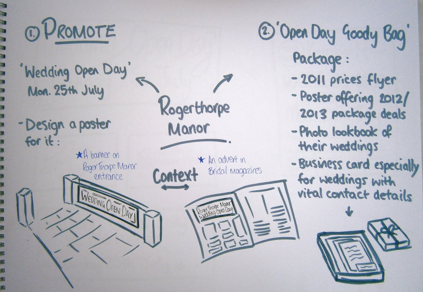
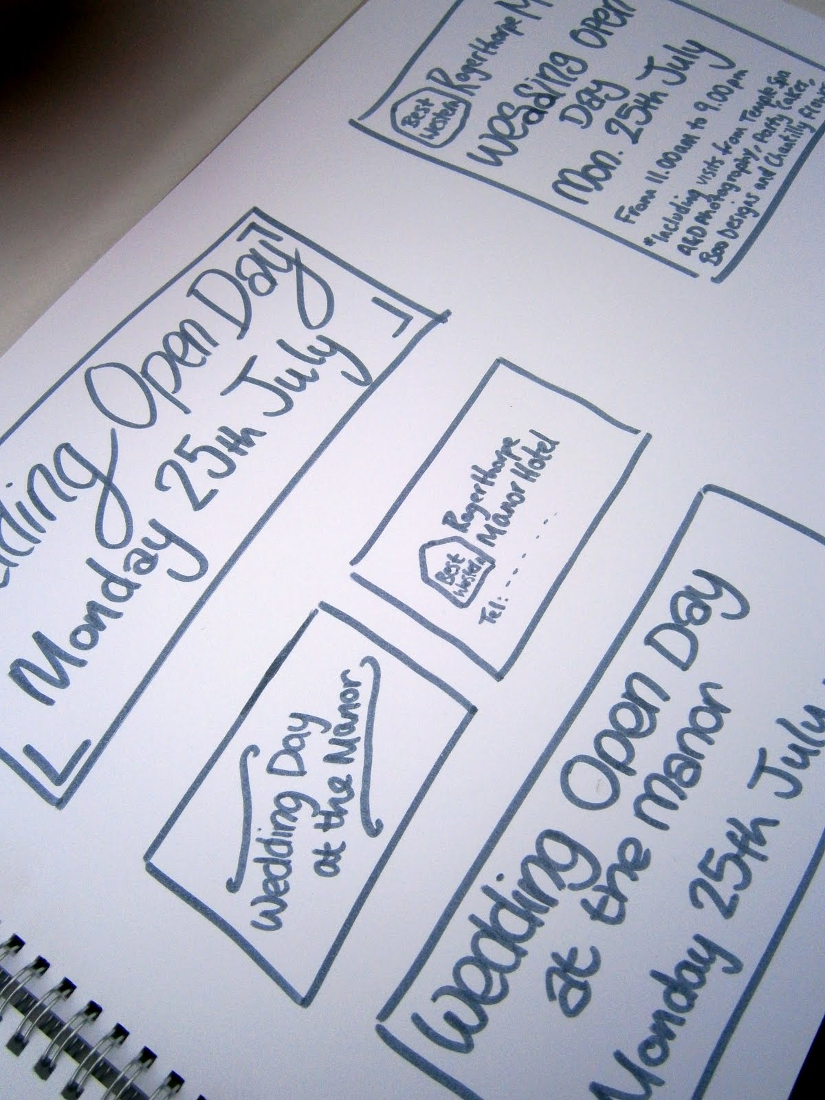
Banner & Magazine promotion
I wanted to create a banner to advertise Rogerthorpe Manor's wedding open day as I thought this would be a good way to promote and get more people to come and see what they could expect on their wedding day and hopefully book a date there and then. I wanted this to be a fairly quick brief and I knew I wanted to include my own photography in the designs, but to keep it simple and to the point. I chose to use these 2 photos; the bride and bridesmaids image for the banner as it brings in the idea of a fun, perfect day and the glass centrepiece image for the magazine advert to give a classy feel.


Here is my banner design and a poster layout idea to be used to advertise the event in wedding brochures and magazines.


Here is my banner design and a poster layout idea to be used to advertise the event in wedding brochures and magazines.


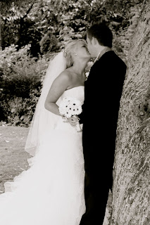
Photography
Here are just a few shots from my wedding photography that I will be using as the imagery for the Rogerthorpe Manor promotions. This wedding had an orange theme, so I want to take this and use it as the colour choice for my designs.






Interesting formats IV
HVD fonts poster on the Behance Network; A foldable promotion for some of the HVD Fonts including Brandon Grotesque, Livory, Brevia and Bumper.


FULL BLOG!!!
To return to the rest of the FMP blog (which ran out of free space) click here:
FINAL MAJOR PROJECT 1
FINAL MAJOR PROJECT 1
Subscribe to:
Posts (Atom)