'I grew up just outside of Philadelphia, Pennsylvania and currently reside in Brooklyn, New York. I create typography, illustrations, patterns and graphics using pencil, pen and watercolor with the computer. Thematically my works lean toward the organic, natural and scientific with vintage, utilitarian and childhood influences.'
sashaprood.com
Bradley-McQuade
This Bradley-McQuade collaboration on the bottom left of the book spread shows an interactive poster that can become 3D letters if torn and folded from the original 2D poster design.
Here is an example of Thom Bradley's own design of a 3D type design in an exhibition space and the full typeface for it.
Benoit
Benoit Lemoine, a french graphic designer created this design for a poster and flyer context, giving the impression the paper sheets were really stuck on the wall. I particularly like the type trickery, where 2D type appears 3D but printed onto 2D media.
Photography
Concertina layout
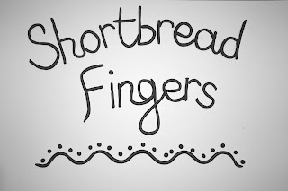
Here is the basic layout that each concertina booklet will form. I wanted to get the type, photos and grid sorted to then be able to add the handcrafted details after. The recipe headings and the cover design will involve the handcrafted icing and sauce typefaces so to work with those I chose a simple sanserif font for the recipes and a hand drawn simple script font to highlight the ingredients sections and the photograph captions. I want to choose a different colour theme for each booklet, so the headings, borders, faded background box and caption will all run with that colour along each page, front and back (they won't be grey like below).
Biscuits
Cakes
Pastries
Rough layout
To re-cap on the Be-Ro recipe brief, the rest of the posts on the first fmp blog are here.
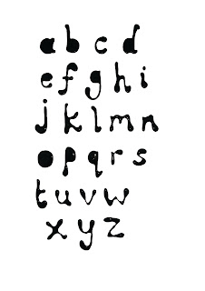
I have already played around with ideas for the four mini recipe books and wanted to incorporate my love for handcrafted type, so as shown on earlier posts I have explored food type and really liked the effect I got from the chocolate sauce type, so I have designed the alphabet below to be able to use the letters on the cover design and on promotional posters, etc.
Here is the simple concertina idea that I have roughly laid out to work from. All four mini books will have the same layout and the actual recipes and information will be an existing digital font with my own photographs being used on every other page.
inside
back
rough cover
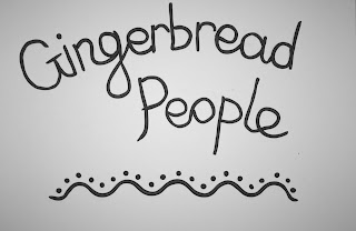
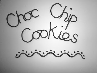
The chocolate sauce is going to be used for the cover, but I also really like the detail you can get from piped icing type (and plasticine to achieve an iced look), so I have experimented with this with the idea in mind of using this for the recipe headings on each page.
I have already played around with ideas for the four mini recipe books and wanted to incorporate my love for handcrafted type, so as shown on earlier posts I have explored food type and really liked the effect I got from the chocolate sauce type, so I have designed the alphabet below to be able to use the letters on the cover design and on promotional posters, etc.
Here is the simple concertina idea that I have roughly laid out to work from. All four mini books will have the same layout and the actual recipes and information will be an existing digital font with my own photographs being used on every other page.
inside
back
rough cover
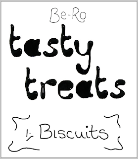
The chocolate sauce is going to be used for the cover, but I also really like the detail you can get from piped icing type (and plasticine to achieve an iced look), so I have experimented with this with the idea in mind of using this for the recipe headings on each page.
Andrew Byrom
This 2D/3D typeface design, St. Julian, has been designed in a German black-letter stencil style by Andrew Byrom.
Here is another of Byrom's creations, this time influenced by the forms made when opening and closing venetian blinds.
Subscribe to:
Posts (Atom)