One of the main aims in my original Statement of Intent was to drive my work towards a focused portfolio so that it matches my position statement: 'typography and layout for small scale publications and design for print with a focus on hand drawn type and photography.' I feel that the briefs I have chosen to produce work for have allowed me to do this and that by summing up my identity with a hand drawn logo ties it all together and the statement is reflected in what I have to show.
Another main goal was to improve on a lot of things that I picked up on towards the end of the last module, such as better time management and just going with a concept I like straight away instead of spending too much time thinking about it and writing down ideas. I think I improved on aspects of this, but I definitely feel that I haven't produced all four minimum briefs to being substantial briefs of the same standard. A major downfall in my final major project was becoming too interested in the two longer briefs that were supposed to be ongoing and running alongside the other shorter briefs. I really enjoyed the hand crafting that went into the Seasonal Range gift wrap brief and the experimentation of type with the Be-Ro Recipe Book and even though I am really happy with how these two briefs turned out, I really wish I had put as much effort into the other two briefs. I changed my concept and subject of the Rogerthorpe Manor brief and this led to me not having much time to play with multiple concepts resulting in me choosing to go with an idea that I do like, but feel could have been played around with and tested out further. The idea of exploiting all briefs has therefore not been carried out to as high a standard as I would have liked or know I could have produced. Another major alteration to the original aims was with the fourth brief, Retail Type, because I really wanted this to be a hands on crafty brief involving experiments with 3D type using various media and photographing it showing it in context of a wall display in the retail environment. I didn't complete this to anywhere near the level I wanted to and, as I mentioned earlier, this was definitely due to my head being buried into the first two briefs. I think I work better when I have deadlines set in stone instead of trying to work on all of them at the same time and thinking I have plenty of time to work on those that fall behind. However, to try and resolve this problem I altered the direction of the brief and chose to create a 2D typeface with a 3D playful feel as I hadn't left enough time to produce what I originally wanted to. This brief is definitely one that I want to continue in my spare time and practice with as all the research carried out for it, including that put together in my context book, have excited and inspired me to experiment with more interesting media and not just play it safe with simple 2D hand drawings.
The Tigerprint competition brief was a quick turnaround brief without having to produce a full range of concepts and products. It was straight to the point, clear to what I had to do and when, and I am really pleased with the designs I put together for this. This happened too late on in the module, however, for me to realise how I work best and to take the same approach with the other briefs.
However, the final major project has shown me that I still have a major passion for the hand drawn and photography aspect of design and I want to ensure that I use this enthusiasm as the basis of future projects and it will hopefully help to strengthen my current portfolio and show a style that flows throughout all my work that I can be proud of.
All final pdfs of boards
1. Be-Ro Recipe Book
2. Seasonal Range
3. Rogerthorpe Manor
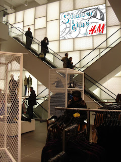
4. Retail Type
5. Tigerprint Competition
2. Seasonal Range
3. Rogerthorpe Manor
4. Retail Type
5. Tigerprint Competition
Context book printed and bind
I'm really pleased with how the book printed out, as I chose to print onto off white sugar paper so was a little aprehensive about how the colours would turn out. However, the images were really crisp and bright and to continue the hand printed and crafted feel I decided to bind it myself and chose to do a blanket stitch to hold the individual spreads together and a simple crossover stitch to attach the cover and finish it all off.


Here is how the content looked with a blanket stitch before the cover was added:


Here is how the content looked with a blanket stitch before the cover was added:


To do list crazy
Over the past few months I have not shown evidence of many action plans on my blog, which I regret, as in other modules I usually do put them up. In hindsight I know I should have posted regular to do lists to show better evidence of time management, but every day I seem to live my life through lists on paper and prefer to do daily and weekly action plans by hand to have in front of me while I work, and gradually they have built up and here's a shot of just some of my scribbly aims from over the Final Major Project. I will literally write on anything when I think of something else I need to do...there's even an envelope in there somewhere!


My context book layouts
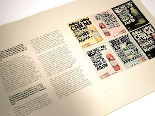
The idea behind the layout was to keep it simple and where possible create full image spreads to let the research and design speak for itself. Here are a few examples of spreads taken from the 'Top ten handcrafted type' chapter which show just that. This chapter I kept a running theme with the layout as it is a showcase of designer's work grouped together, so it is a good example of the typical style the book is taking.


Another layout
Layout ideas
As shown by these practice layouts below, I want the images found and gathered to dominate the spread, so I have explored ways that this could work and where the text could sit around the images. Obviously it depends on the scale of the images found as to where they fit best on the page, but I want to have various layouts that all fit to the same grid, but mix the spreads up a bit to allow the reader to keep interest.


Pulished book layouts
Vicki Gausden
'I'm a Freelance Illustrator & Hand Lettering Artist based in Edinburgh, UK. I produce bold, quirky and humorous images that are perfect for print and the web. I like to write and illustrate children's books and I have a passion for cupcakes, pretty patterns and handmade objects. My previous clients include Random House, BEAM Education and the National Trust. ' Taken from her website; www.vickigausden.co.uk


Subscribe to:
Comments (Atom)


