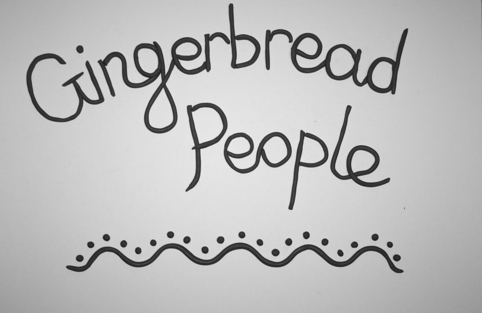
I have already played around with ideas for the four mini recipe books and wanted to incorporate my love for handcrafted type, so as shown on earlier posts I have explored food type and really liked the effect I got from the chocolate sauce type, so I have designed the alphabet below to be able to use the letters on the cover design and on promotional posters, etc.
 Here is the simple concertina idea that I have roughly laid out to work from. All four mini books will have the same layout and the actual recipes and information will be an existing digital font with my own photographs being used on every other page.
inside

back

rough cover


The chocolate sauce is going to be used for the cover, but I also really like the detail you can get from piped icing type (and plasticine to achieve an iced look), so I have experimented with this with the idea in mind of using this for the recipe headings on each page.